What do you think?
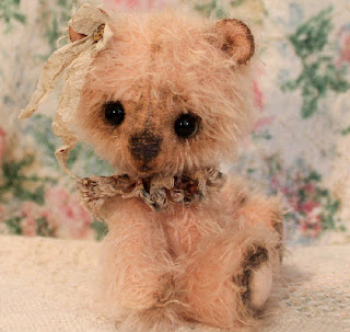
My previous post was pictures of Flower and I am posting
more pictures of her here. I would like your thoughts on the
pictures. I am trying to decide if Flower looks better with a
dark contrasting background or something lighter for a background.
Thanks for any thoughts. :D
(oh and Flower is still available for adoption on
BearPile and Etsy!)
;)
(oh and Flower is still available for adoption on
BearPile and Etsy!)
;)


hmmmm.. oh, definitely a darker background. The flowery looks soft/pastel/summery - but I cannot see her 'margins' very well.
ReplyDeleteShe just appears to POP off the page against the darker background.
It needn't be black if you think that's too harsh, just a good contrast.
Thank you, Bobbie. I think you are right, but I also felt the black was a bit too harsh for Flower, so I will find something dark but not quite as dark as the black for bears like her in the future. ;) And my son said exactly what you said. :)
ReplyDeleteI love that wee face, and her little fringe, so cute!
ReplyDelete